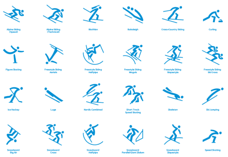
The vision of the 2018 PyeongChang Games is New Horizons - the hope of showcasing Korea and all it has to offer as a winter sports and tourist destination through the world’s biggest sporting event. This vision has also been incorporated into the design of the pictograms to ensure a local look and feel.
They have been designed based on the Korean alphabet known as Hangeul. This is a system of letters that is unique to Korea and it was also used in the design of the official Games emblems. From the 16 vowels and 14 consonants of Hangeul that exist, four consonants and three vowels were selected and have been reflected in the pictograms.
The pictograms represent the 24 sporting competitions across the 15 disciplines of the Olympic Winter Games. These easily identifiable symbols will become synonymous with the different sports during the Games, as they guide fans to their events. From 8th- 25th February 2018 these emblems will come to life as more than 3,000 athletes compete for Olympic glory.
With the pictograms, the aim is for the beauty of this alphabet to be reflected in these symbols and shared with the global audience, giving people the chance to learn and understand more about Korean culture.
The most representative poses of each discipline were chosen and the alphabet use allows for them to be reflected in a minimalistic way. The slanted and curved lines help express the movements of the joints and limbs which add more dynamism to the pictograms.
These flowing lines and dynamic images also try to reflect the Olympic spirit: the infinite potential, the challenging spirit and the passion that the athletes will show.
The pictograms will be used on marketing materials and signage across the look and feel of the Games. They will also provide valuable information to visitors and participants coming from all over the world and speaking different languages.
POCOG President LEE Hee-beom said, “The pictograms are an important element of the Olympic Games and there is always a level of excitement and anticipation around the design of these, just as we saw with the official mascots. I believe our design team has got the perfect balance with our designs to make them easily identifiable while also having a local connection and Korean feel as we have integrated our unique alphabet into the pictograms.”


 RSS Feed


